Skip to content
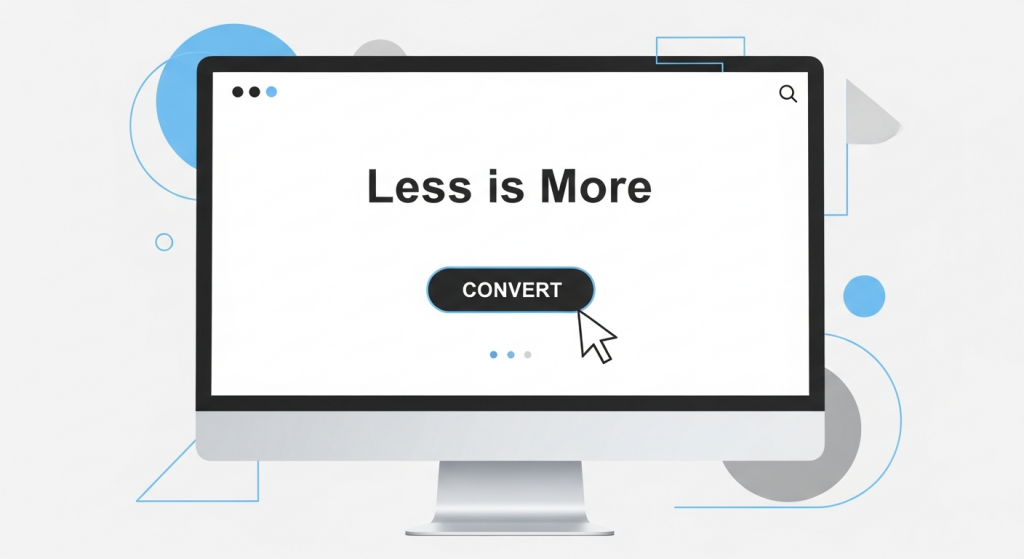 Less Is More: How Minimalist Web Design Boosts Conversions In the competitive digital landscape, it’s tempting to believe that a successful website needs more of everything: more features, more graphics, more text, more options. We often see business owners trying to cram every piece of information onto their homepage, fearing a potential customer might miss something. But what if the secret to capturing more leads and sales isn’t about adding more, but strategically taking things away? Welcome to the world of minimalist web design. Far from being an empty or boring aesthetic, minimalism is a powerful, user-centric philosophy that prioritizes clarity, speed, and function. For a small business, adopting a minimalist approach isn’t just a style choice; it’s a strategic move that can dramatically improve your conversion rates. Let’s explore how simplifying your digital storefront can lead to significant business growth. What Exactly Is Minimalist Web Design? Minimalist web design is a principle rooted in the idea that a design should not have any unnecessary elements. Every button, image, and line of text serves a distinct purpose. It’s about cutting through the noise to present your message and your value proposition with absolute clarity. Think of it as a spotlight, focusing your user’s attention exactly where you want it to go. This approach is built on several key pillars: Negative Space: Often called “white space,” this is the empty area around elements on a page. It’s not wasted space; it’s an active design tool that reduces clutter, improves readability, and creates a sense of calm and sophistication. Simple Color Palettes: Minimalist designs typically use a limited and carefully chosen color scheme. This creates visual harmony and helps important elements, like call-to-action buttons, stand out. Bold, Clear Typography: With fewer visual distractions, typography becomes a central design element. Clean, legible fonts are used to create a strong visual hierarchy and guide the user’s eye through the content. Essential-Only Elements: This is the core of minimalism. Before adding any element to a page, you must ask: “Does this serve a critical function or help the user achieve their goal?” If the answer is no, it doesn’t belong. Intuitive Navigation: A simple, logical menu structure is paramount. Users should be able to find what they’re looking for instantly, without having to think or search. The Psychology of Simplicity: Why Minimalism Converts The effectiveness of minimalist design isn’t just a matter of taste; it’s grounded in human psychology. When a user lands on your website, their brain is subconsciously evaluating it for trustworthiness and ease of use. A cluttered, chaotic design sends signals of disorganization and can be overwhelming, causing visitors to leave before they even understand what you offer. Reducing Cognitive Load Cognitive load refers to the amount of mental effort required to use a website. When a page is filled with competing elements—multiple pop-ups, clashing colors, and confusing navigation—it overloads the user’s brain. This leads to a phenomenon known as “analysis paralysis.” This is best explained by the psychological principle of Hick’s Law, which states that the time it takes to make a decision increases with the number and complexity of choices available. By removing unnecessary options and distractions, a minimalist design reduces cognitive load, making it easier for a visitor to make the single most important decision: to convert. Building Trust Through Clarity A clean, professional, and straightforward design inspires confidence. It communicates that you are a credible business that values your customer’s time and attention. When your message is clear and your user journey is seamless, you remove friction and build a subconscious layer of trust that makes a visitor more comfortable sharing their contact information or making a purchase. The Tangible Business Benefits of a Minimalist Website Beyond the psychological impact, a minimalist approach delivers concrete, measurable advantages for your business. It directly addresses key performance indicators that affect your bottom line, from search engine ranking to sales. 1. Dramatically Faster Loading Speeds Every second counts online. A minimalist website, by its very nature, has fewer large image files, complex scripts, and heavy animations. This results in a lighter, faster website. Why is this critical? According to research from Google, the probability of a user bouncing from your site increases by 32% as page load time goes from 1 second to 3 seconds. Faster loading times not only keep impatient users on your site but are also a major ranking factor for search engines. A quick, responsive site is a core component of any effective SEO Strategy, helping you climb the rankings and attract more organic traffic. 2. A Superior User Experience (UX) Great UX is about making it effortless for a visitor to accomplish their goal. Minimalist design forces you to focus on the user journey. By stripping away non-essential elements, you create a clear path from the moment a user lands on your page to the moment they click “Buy Now” or “Submit.” This is especially important for mobile users. A clean, simple layout translates beautifully to smaller screens, ensuring a consistent and positive experience for the majority of today’s internet users. A frustrating mobile experience is a guaranteed way to lose a customer; a minimalist design is your best defense against it. 3. Higher Conversion Rates This is where everything comes together. A faster, more trustworthy, and easier-to-use website will inevitably lead to more conversions. Here’s how the principles of minimalism directly impact your ability to turn visitors into customers: Prominent Calls-to-Action (CTAs): With less visual clutter, your CTA buttons stand out. Using a contrasting color and surrounding it with negative space makes it impossible to miss, guiding users to take the next step. Focused Attention: Without distracting sidebars, carousels, or pop-ups, the user’s attention is directed toward your core message and value proposition. You control the narrative and lead them directly to the conversion point. Improved Readability: Clear typography and ample spacing make your content easier to scan and digest. Users can quickly understand the benefits of your product or service, making them more
 Unlock More Sales: Why Mobile Optimization is Your Secret Weapon for Higher Conversions Picture this: a potential customer, Sarah, is waiting for her coffee. She pulls out her smartphone to look up a local service she needs—the exact service your business provides. She finds your website through a quick search, taps the link, and… waits. The page loads slowly. The text is minuscule, forcing her to pinch and zoom. The menu is a jumble of tiny links impossible to tap with a thumb. Frustrated after just a few seconds, she hits the back button and clicks on your competitor’s link instead. Their site loads instantly, is easy to read, and she books an appointment in under a minute. You just lost a customer. Not because of your product or your pricing, but because your digital storefront was unwelcoming. In today’s digital landscape, this scenario plays out thousands of times a day. Having a beautiful website that works flawlessly on a desktop computer is no longer enough. Your customers live on their mobile devices, and if your website isn’t optimized for their experience, you are actively leaving money on the table. Mobile optimization is no longer a “nice-to-have” feature or a technical checkbox. It is a fundamental component of a successful digital strategy and one of the most powerful levers you can pull to increase leads, sales, and overall business growth. What Exactly is Mobile Optimization? In simple terms, mobile optimization is the process of ensuring that visitors who access your site from a mobile device have an experience tailored for that device. It’s about more than just making your website shrink to fit a smaller screen. It’s about creating a seamless, intuitive, and efficient journey for the on-the-go user. This involves a few key concepts that work together to create a powerful mobile presence for your brand. Responsive Design: The Modern Standard The gold standard for mobile optimization today is responsive web design. Instead of creating a separate, stripped-down mobile version of your site (an outdated practice), a responsive website uses a flexible grid that automatically adapts the layout, content, and images to fit the screen size of any device. Whether a visitor is on a 27-inch desktop monitor, a 10-inch tablet, or a 6-inch smartphone, the experience is consistently excellent. This approach is not only more efficient to manage but is also what search engines like Google prefer. Beyond Aesthetics: The User Experience (UX) Factor True mobile optimization goes deeper than just the layout. It’s about the entire user experience (UX). This means focusing on how easy and enjoyable it is for a mobile visitor to accomplish their goal on your site. A great mobile UX includes: Fast Loading Times: Mobile users are impatient. A few seconds of delay can be the difference between a new customer and a lost opportunity. Readable Text: Fonts should be large enough to read comfortably without needing to zoom in. Thumb-Friendly Navigation: Buttons and links must be large enough and spaced far enough apart to be easily tapped without accidental clicks. Simplified Forms: Contact forms and checkout fields should be short, with large input fields that are easy to fill out on a small keyboard. The Hard Data: Why Mobile Can’t Be Ignored The shift to mobile isn’t a fleeting trend; it’s a permanent change in consumer behavior. The numbers speak for themselves. As of 2023, mobile devices generated over 60% of all global website traffic, a figure that continues to climb each year. For many small businesses, especially those in local service or e-commerce industries, that number is often much higher. Ignoring this massive segment of your audience is like closing your shop for more than half the day. Think of your marketing budget as the water you pour into a bucket. You spend money on social media ads, email marketing, and search engine visibility to fill that bucket with potential customers. But if your website isn’t optimized for mobile, it’s like having a giant hole in the bottom. You’re paying to attract visitors, only to have them “leak” out due to a frustrating experience before they can ever convert into a lead or sale. How Mobile Optimization Directly Boosts Your Conversions Improving your mobile website isn’t just about making things look nice; it has a direct and measurable impact on your bottom line. A strategic focus on the mobile experience drives conversions in several key ways. 1. It Builds Trust and Credibility Your website is often the very first interaction a potential customer has with your brand. A sleek, fast, and easy-to-use mobile site instantly signals professionalism and competence. It shows that you are a modern business that cares about its customers’ experience. Conversely, a clunky, outdated site creates friction and doubt, making visitors question the quality of your actual products or services. 2. It Reduces Friction in the Buyer’s Journey The goal of any business website is to guide the user toward a specific action, whether that’s filling out a contact form, making a purchase, or calling your office. Mobile optimization is all about removing barriers. This includes features like click-to-call buttons that let a user dial your number with a single tap, simplified checkout processes with mobile-friendly payment options, and forms that are easy to complete. By making it effortless for customers to take the next step, you dramatically increase the likelihood that they will. 3. It Improves Your Search Engine Rankings (SEO) For years, Google has been operating on a “mobile-first indexing” basis. In simple terms, this means Google primarily uses the mobile version of your website for indexing and ranking. If your site performs poorly on mobile—if it’s slow, hard to navigate, or has content missing—your search engine rankings will suffer across all devices, even for desktop searches. A strong mobile experience is a critical component of any modern SEO strategy, making it easier for customers to discover you in the first place. 4. It Capitalizes on “Micro-Moments” Think about how people use their phones. They
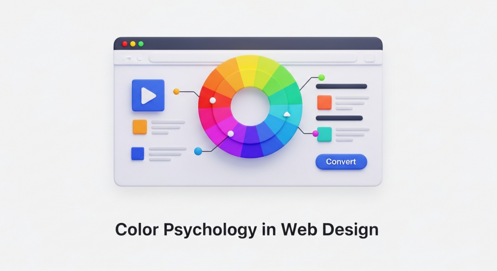 How to Use Color Psychology in Web Design to Increase Conversions As a business owner, you know that your website is more than just a digital brochure; it’s your most powerful sales tool. Every element, from the headlines you write to the images you choose, plays a role in turning a visitor into a customer. But did you know that one of the most influential factors is something most people perceive subconsciously? We’re talking about color. The colors you use on your website have a direct impact on how users feel, think, and act. Choosing a color palette isn’t just an aesthetic decision—it’s a strategic one. By understanding the basics of color psychology in web design, you can create a more persuasive user experience, build brand trust, and ultimately, increase your conversion rates. Let’s explore how you can use color to transform your website’s performance. What is Color Psychology and Why Does it Matter for Your Website? Color psychology is the study of how colors affect human emotions and behavior. In marketing and web design, it’s the practice of using specific colors to evoke a desired response from your audience. When a visitor lands on your site, they form an impression within seconds, and color is responsible for up to 90% of that initial judgment. A strategic website color scheme does three crucial things: Communicates Your Brand Identity: Are you a trustworthy financial firm or a playful children’s brand? Your colors should instantly communicate your brand’s personality. Guides the User’s Eye: Smart use of color and contrast can draw attention to the most important parts of your page, like a “Request a Quote” button or a key benefit. Influences Purchase Decisions: The right colors can create a sense of urgency, build trust in your payment process, or make a product feel more luxurious, directly influencing a user’s decision to buy. Ultimately, color is a silent communicator that shapes user experience. A positive experience keeps users on your site longer, reduces bounce rates, and sends positive signals to search engines—an often-overlooked component of a comprehensive SEO strategy. Understanding the Emotional Impact of Common Colors While color perception can be subjective and influenced by personal experience, broad patterns have been observed in how people respond to different hues. Understanding these general associations is the first step in building an effective website color scheme. Here’s a breakdown of common colors and the emotions they typically evoke. Warm Colors: Red, Orange, and Yellow Warm colors are associated with energy, passion, and happiness. They are excellent for grabbing attention and creating a sense of action. Red: The color of passion, excitement, and urgency. Red is a powerful accent color used to stimulate action. It’s why you see it so often on clearance sale signs and call-to-action (CTA) buttons like “Order Now.” Brands like YouTube and Netflix use red to create excitement. Orange: A blend of red’s energy and yellow’s cheerfulness. Orange is friendly, enthusiastic, and confident. It’s a great choice for CTAs that encourage immediate action, such as “Sign Up Free” or “Get Started.” HubSpot and Amazon use orange to appear accessible and action-oriented. Yellow: Associated with optimism, sunshine, and youthfulness. Yellow is highly visible and great for drawing attention to specific design elements. However, use it sparingly, as too much can cause eye strain. Brands like IKEA and Snapchat use it to project a fun, positive vibe. Cool Colors: Blue, Green, and Purple Cool colors are often perceived as calm, professional, and trustworthy. They are ideal for brands that want to build a sense of security and reliability. Blue: The king of corporate colors. Blue inspires feelings of trust, security, and dependability. This is why it’s overwhelmingly popular among financial institutions, tech companies, and healthcare providers. Think of PayPal, Facebook, and Dell—they all use blue to build user confidence. Green: The most versatile color, with strong ties to nature, health, growth, and wealth. A darker green can signify affluence, while a lighter green relates to tranquility and the environment. It’s an excellent choice for a “Go” or “Submit” button as it signals a positive, forward action. Brands like Whole Foods and Starbucks use it effectively. Purple: Historically associated with royalty, purple communicates luxury, wisdom, and creativity. Lighter shades can feel romantic and nostalgic, while darker shades feel rich and sophisticated. It’s a great choice for high-end beauty products or creative service brands like Hallmark. Neutral Colors: Black, White, Gray, and Brown Neutrals are the backbone of most web designs. They provide balance and can be paired with warm or cool colors to create a sophisticated and clean look. Black: Represents power, elegance, and sophistication. When used correctly, black can create a dramatic, modern feel, making it popular with luxury and fashion brands like Chanel and Nike. White and Gray: These colors communicate simplicity, cleanliness, and modernity. White space is essential for good design, as it gives content room to breathe and improves readability. Gray is a versatile background color that provides a softer alternative to stark white. Apple is a master of using white and gray to create a minimalist, high-tech aesthetic. Brown: An earthy, dependable color that evokes a sense of ruggedness and reliability. It’s a natural choice for organic products, outdoor brands, and companies that want to appear grounded. How to Build a High-Converting Website Color Scheme Simply picking a color you like isn’t enough. A high-converting website uses a balanced and intentional color palette to guide the user journey. The most effective approach is to follow the 60-30-10 rule, a classic design principle that ensures visual harmony. 60% Primary Color: This is your dominant brand color. It will occupy the most visual space on your site, often used for backgrounds and major design elements. It sets the overall tone and mood of your website. 30% Secondary Color: This color should contrast with your primary color to create visual interest. It’s used for less-dominant elements like subheadings, highlighted content areas, or secondary buttons. 10% Accent Color: This is your most important
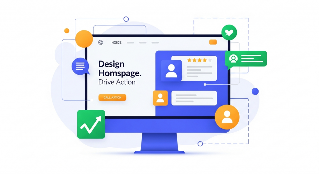 How to Design a Homepage That Drives Action Your homepage is the digital front door to your business. For most visitors, it’s their first interaction with your brand, and it has mere seconds to make a positive impression. A cluttered, confusing, or slow homepage can send potential customers clicking away before you ever have a chance to show them what you offer. Conversely, a strategically designed homepage can act as your most effective salesperson, guiding visitors, building trust, and driving them toward a specific action. Many small business owners treat their homepage like a brochure, packed with information but lacking a clear purpose. The goal isn’t just to inform; it’s to convert. Whether a conversion means making a purchase, filling out a form, or picking up the phone, your homepage design is the engine that powers that result. This guide will walk you through the essential elements and strategies needed to transform your homepage from a passive placeholder into an active tool for business growth. First Impressions Matter: Mastering the “Above the Fold” Area The term “above the fold” comes from the newspaper industry and refers to the top half of the front page—the part visible when the paper is folded. In web design, it’s the section of your homepage a visitor sees without scrolling. According to research, users spend about 80% of their time above the fold. This tiny window of opportunity is where you must capture their attention and convince them to stay. If a visitor can’t immediately understand what your business does and why they should care, they will leave. You need to answer their three core questions instantly: Where am I? What can I do here? Why should I do it? The Essential Above-the-Fold Elements To make an immediate impact, this prime real estate should feature three critical components working together: A Clear and Compelling Value Proposition: This is a concise statement that explains the unique benefit you provide. It should clearly articulate who your customers are, what problem you solve for them, and what makes you the best choice. Avoid vague marketing jargon. Instead of “Synergistic Business Solutions,” try “Effortless Accounting Software for Freelancers.” An Attention-Grabbing Headline: Your main headline should support your value proposition and speak directly to your target audience’s needs or desires. It should be short, impactful, and benefit-oriented. A strong headline connects emotionally and logically, making the visitor feel understood. A Primary Call to Action (CTA): This is the single most important action you want a visitor to take. It should be presented as a bold, visually distinct button with clear, action-oriented text like “Get Your Free Quote,” “Schedule a Demo,” or “Shop Our Collection.” Don’t make them hunt for it. These elements should be supported by high-quality, professional visuals. A “hero image” or a short background video that reflects your brand and resonates with your audience can immediately convey a sense of quality and professionalism, making your message more impactful. Building Trust and Credibility Instantly Before a visitor will take action, they need to trust you. A new user has no reason to believe your claims, so your homepage must work hard to establish credibility from the moment they land. Trust signals are subtle (and not-so-subtle) cues that show you are a legitimate, reputable, and trustworthy business. The Power of Social Proof Social proof is the psychological phenomenon where people assume the actions of others in an attempt to reflect correct behavior. On your homepage, this means showing visitors that other people have already trusted you and had a positive experience. Effective forms of social proof include: Customer Testimonials: Feature short, powerful quotes from happy clients. Including their name, company, and a photo adds a significant layer of authenticity. Client Logos: If you serve other businesses, displaying the logos of well-known clients you’ve worked with is a powerful and immediate credibility booster. Ratings and Reviews: Showcasing a high average rating from sites like Google, Yelp, or industry-specific review platforms can quickly build confidence. Awards and Certifications: Displaying badges from industry awards, accreditations, or security certifications (like a Better Business Bureau seal) shows that your business is recognized and vetted by third parties. Professional Design and Intuitive Navigation Nothing erodes trust faster than a poorly designed website. An outdated, broken, or amateurish design suggests that the business behind it may be equally unprofessional. A clean, modern, and visually appealing layout is a fundamental trust signal. It shows you care about your brand and your customers’ experience. Our Website Design Services focus on creating this exact kind of professional polish that elevates your brand perception. Equally important is navigation. Your main menu should be simple, logical, and easy to understand. Visitors should be able to find key information—like your services, about page, and contact details—without any friction. A frustrating navigation experience will lead to a high bounce rate and a poor perception of your company. Guiding the User Journey with Strategic Calls to Action A successful homepage doesn’t just present information; it guides the user on a journey. Calls to action are the signposts on that journey. While your primary CTA above the fold is crucial, you need to strategically place other CTAs throughout the page to cater to visitors at different stages of their decision-making process. Primary vs. Secondary CTAs Not everyone who visits your site is ready to buy immediately. To avoid alienating these users, it’s wise to use a mix of primary and secondary CTAs. Primary CTAs are for users who are ready to take the next step. They are high-commitment actions and should be designed to stand out with bright, contrasting colors and direct, compelling language (“Start Your Free Trial,” “Book a Consultation”). Secondary CTAs are for users who need more information before they commit. These are lower-commitment actions, such as “Learn More About Our Process,” “View Our Portfolio,” or “Download Our Free Guide.” These buttons should be less visually dominant than primary CTAs, perhaps using a less vibrant color or an outline style. By offering both,
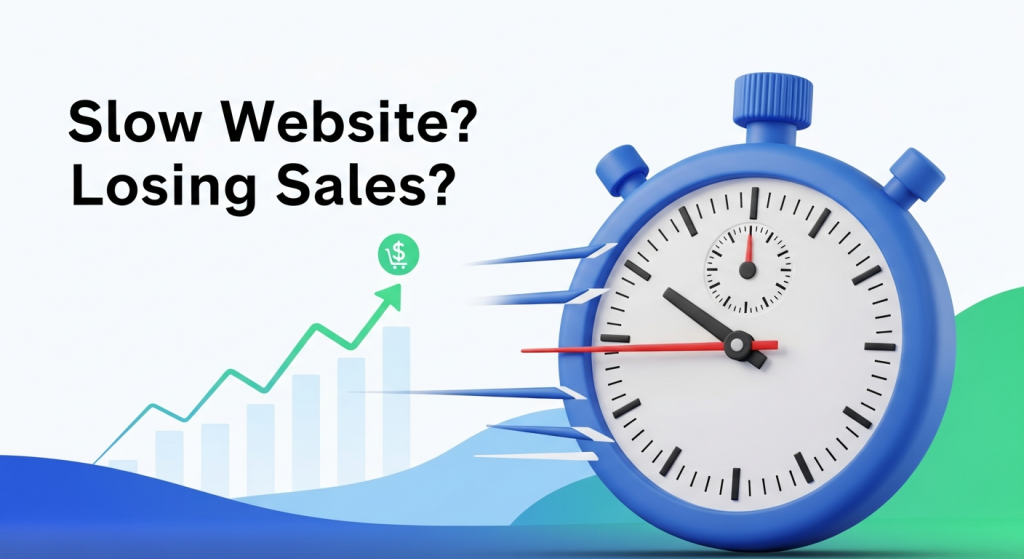 Is Your Slow Website Costing You Customers? The Real Impact of Page Load Time on Conversions Imagine a potential customer, excited about your product, clicks on your ad. They land on your website, ready to buy. But the page just shows a loading symbol. One second passes. Then two. Then three. Frustrated, they click the back button and head straight to your competitor. This isn’t just a hypothetical scenario; it’s a daily reality for businesses with slow websites, and it’s silently eroding their revenue. In today’s fast-paced digital world, speed isn’t just a feature—it’s the foundation of a positive user experience. For a small business, your website is often the first and most important interaction a customer has with your brand. If that first impression is a frustrating wait, you’ve likely lost a sale before you even had a chance to make your pitch. Understanding the critical link between page load time and conversion rates is no longer a technical concern for IT departments; it’s a core business strategy that directly impacts your bottom line. What is Page Load Time and Why Should You Care? Simply put, page load time is the average amount of time it takes for a user’s browser to display all the content on a specific webpage. This includes images, text, videos, and scripts. While it sounds straightforward, this single metric is one of the most powerful indicators of your website’s overall performance and its ability to turn visitors into customers. Think of it as the digital equivalent of walking into a physical store. If the doors are stuck, the lights are flickering, and no one is there to greet you, you’re not going to feel welcome or confident in making a purchase. A slow website creates the same feeling of friction and uncertainty. It tells visitors that your business might be outdated, inefficient, or untrustworthy. Conversely, a snappy, responsive site feels professional and reliable, immediately building trust and encouraging visitors to explore what you have to offer. For a small business, every visitor is valuable. You’ve worked hard and likely spent money on marketing to get them to your site. A slow page load time is like paying for a billboard and then covering it with a tarp. It undermines all your other marketing efforts by creating a poor user experience at the most critical moment—when a potential customer is on your digital doorstep. The Data Doesn’t Lie: How Milliseconds Impact Your Bottom Line The argument for a faster website isn’t just based on intuition; it’s backed by extensive research and hard data. Over the years, major companies have studied user behavior and found a direct, undeniable correlation between speed and revenue. The Direct Link Between Speed and Sales Even the slightest delay can have a staggering effect on your ability to convert a visitor. The modern consumer is conditioned for instant gratification, and their patience online is incredibly thin. When your page takes too long to load, they don’t just wait—they leave. According to Google, as page load time goes from one second to three seconds, the probability of a visitor leaving (bouncing) increases by 32%. If it goes to five seconds, that probability skyrockets to 90%. A landmark study by Deloitte Digital revealed that a mere 0.1-second improvement in site speed led to an 8.4% increase in conversions and a 9.2% increase in average order value for retail brands. Google’s own research found that a one-second delay in mobile load times can impact conversion rates by up to 20%. For a business generating sales online, that’s a massive amount of revenue lost to preventable friction. Beyond Conversions: The Hidden Costs of a Slow Website The damage from a slow website extends far beyond the immediate lost sale. It can have long-term consequences for your brand’s reputation and visibility. First, there’s the issue of brand perception. A clunky, slow-loading site feels unprofessional. It can make your business appear less legitimate or successful than your faster competitors. This negative perception can linger, making it harder to win back a customer’s trust in the future. Second, a slow site dramatically increases your bounce rate. The bounce rate is the percentage of visitors who land on your website and leave without clicking on anything else. A high bounce rate is a clear signal to search engines like Google that your page isn’t providing a good user experience or delivering what visitors are looking for. This brings us to another critical area where speed matters: your search engine ranking. How Website Speed Influences Your Google Ranking Google’s primary goal is to provide its users with the most relevant and highest-quality results for their queries. A huge part of that quality is the user experience on the page itself. If a user clicks a link and is met with a frustratingly slow website, that reflects poorly on Google’s recommendation. Therefore, Google has made site speed a confirmed ranking factor. In recent years, this has become even more formalized with the introduction of Core Web Vitals. These are a set of specific metrics that Google uses to measure a page’s real-world loading performance, interactivity, and visual stability. While the technical details can be complex, the takeaway for business owners is simple: Google actively measures and rewards websites that provide a fast, seamless experience for visitors, especially on mobile devices. This means a faster website doesn’t just help you convert the traffic you already have; it helps you get more traffic in the first place. By improving your page load time, you send positive signals to Google, which can lead to higher rankings in search results. This increased visibility means more organic traffic, more potential customers, and more opportunities to grow your business. A comprehensive SEO strategy is incomplete without a strong focus on technical performance and site speed. How Fast Is Fast Enough? Measuring Your Performance So, you understand that speed is important, but how do you know where your website stands? Fortunately, you don’t have to guess. There
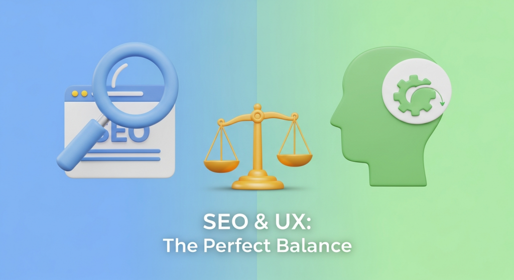 The Perfect Balance: A Small Business Guide to SEO and User Experience The Great Debate: Designing for Google or for People? As a small business owner, you know your website is your most important digital asset. It’s your 24/7 salesperson, your brand ambassador, and your primary tool for generating leads. But when it comes to designing it, a common question arises: should you prioritize search engine optimization (SEO) to please Google, or user experience (UX) to delight your customers? For years, this has been framed as a conflict, forcing businesses to choose between a site that ranks well and one that people love to use. The truth is, this is a false choice. In today’s digital landscape, SEO and UX are not competing forces; they are two sides of the same coin. A website that provides a fantastic user experience is more likely to rank well on search engines, and a well-optimized site drives qualified traffic to a platform designed for conversion. Thinking of them as separate strategies is an outdated approach that will leave you trailing the competition. The most successful businesses understand that the secret to online growth lies in balancing both. Let’s quickly define our terms. SEO is the practice of optimizing your website to be found by search engines for relevant queries. It’s how you get people in the door. UX, on the other hand, is the overall feeling a person has when using your website. It’s about making their visit easy, intuitive, and enjoyable. It’s how you make them want to stay, explore, and ultimately, do business with you. Why You Can’t Afford to Ignore Either Imagine you invest heavily in SEO. Your website ranks number one for your target keyword. But when visitors arrive, they find a site that’s slow, confusing to navigate, and impossible to use on their phone. They’ll leave in seconds, frustrated and unlikely to return. This is the cost of poor UX. Your high traffic numbers mean nothing if no one converts. Now, picture the opposite. You’ve built a beautiful, fast, and incredibly user-friendly website. It’s a joy to use. The only problem? No one can find it. It’s buried on page ten of Google’s search results. This is the cost of poor SEO. Your perfect website is like a stunning storefront on a deserted street. Search engines like Google have become incredibly sophisticated. They no longer just scan for keywords. They pay close attention to user behavior signals to determine a site’s quality and relevance. These signals include: Dwell Time: How long a visitor spends on your page before returning to the search results. Longer dwell times suggest your content is valuable and engaging—a huge plus for UX and SEO. Bounce Rate: The percentage of visitors who leave your site after viewing only one page. A high bounce rate can signal to Google that your page isn’t a good match for the search query, harming your rankings. Click-Through Rate (CTR): The percentage of people who click on your link in the search results. A compelling title and description (SEO) that accurately reflects a great on-page experience (UX) will improve your CTR. When you provide an excellent user experience, these metrics improve naturally. Google takes notice and rewards you with better visibility. This creates a powerful, self-reinforcing cycle of growth: good SEO brings in the right visitors, and good UX turns them into happy customers, which in turn sends positive signals back to Google. Key Areas Where SEO and UX Overlap Instead of thinking about SEO and UX as separate checklists, focus on the areas where they naturally intersect. Improving these elements will deliver a double benefit, boosting both your search rankings and your customer satisfaction. Website Speed and Performance Patience is not a virtue on the internet. A slow-loading website is a major turn-off for users and a significant red flag for search engines. Google has made page speed a direct ranking factor, formalizing it with metrics called Core Web Vitals. From a UX perspective, if your site takes more than a few seconds to load, a large portion of your visitors will simply give up and go to a competitor. Optimizing images, leveraging browser caching, and choosing a good hosting provider are crucial steps that serve both masters. Mobile-First Design More than half of all web traffic now comes from mobile devices. In response, Google has shifted to mobile-first indexing, meaning it primarily uses the mobile version of your website for ranking and indexing. If your site is difficult to read, navigate, or use on a smartphone, you’re not just frustrating a majority of your users—you’re actively damaging your SEO potential. A responsive design that adapts seamlessly to any screen size is no longer a “nice-to-have”; it’s an absolute necessity for modern Website Design Services. Simple, Intuitive Site Structure A well-organized website is a win for everyone. For users, a logical navigation menu, clear information hierarchy, and features like breadcrumb trails make it easy to find what they’re looking for without confusion. This reduces frustration and keeps them on your site longer. For search engines, a clear structure helps their crawlers understand the relationship between your pages, discover new content, and properly index your entire site. A logical URL structure (e.g., `yourdomain.com/services/web-design`) is both user-friendly and SEO-friendly. High-Quality, Well-Structured Content Content is where SEO and UX truly become one. Your goal is to create content that answers your target audience’s questions thoroughly and authoritatively. An effective SEO Strategy involves researching the keywords and phrases your potential customers are using. But simply stuffing those keywords into thin or poorly written content is a recipe for failure. Your content must also be structured for human readers. Use clear headlines (H1, H2, H3), short paragraphs, bullet points, and relevant images to make your information scannable and easy to digest. This approach satisfies search intent for Google and provides real value for your users. Practical Strategies to Harmonize SEO and UX Knowing that SEO and UX are partners is the first