Skip to content
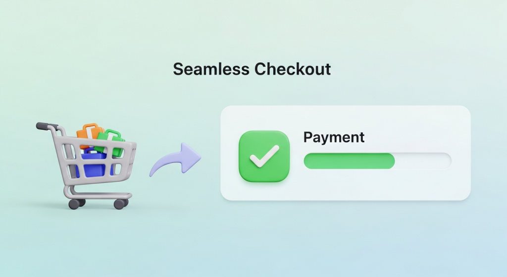 How to Create a Seamless Checkout Experience (and Stop Losing Sales) You’ve done everything right. You’ve built a beautiful online store, sourced incredible products, and crafted a marketing strategy that brings a steady stream of visitors to your site. A customer finds exactly what they want, adds it to their cart, and clicks “Checkout.” But then, nothing. They vanish, leaving another abandoned cart and a lost sale. It’s one of the most frustrating moments for any e-commerce business owner. If this sounds familiar, you’re not alone. The reality is that the final step of the purchase journey is where most businesses lose their customers. A clunky, confusing, or untrustworthy checkout process is the number one culprit. Creating a seamless checkout experience isn’t just a nice-to-have feature; it’s a fundamental requirement for converting browsers into buyers and building a sustainable online business. This guide will walk you through the essential steps to optimize your checkout process, reduce friction, and dramatically increase your conversion rates. Why a Seamless Checkout is Non-Negotiable Before we dive into the “how,” it’s crucial to understand the “why.” Your checkout page is the most critical part of your sales funnel. It’s the final handshake, the moment a potential customer commits to giving you their money. Any hesitation or frustration at this stage can instantly derail the entire sale. The High Cost of Cart Abandonment Shopping cart abandonment is the silent killer of e-commerce revenue. It represents a direct loss of potential income from customers who were ready to buy. According to extensive research by the Baymard Institute, the average cart abandonment rate across all industries is nearly 70%. That means for every ten customers who add an item to their cart, seven leave without completing the purchase. While some abandonment is natural, a significant portion is caused by a poor checkout experience. The top reasons cited by customers include unexpected extra costs (like shipping and taxes), being forced to create an account, and a long or complicated checkout process. Each of these issues is entirely within your control to fix. Building Trust and Customer Loyalty A smooth checkout process does more than just secure a single sale; it builds trust. When a customer can move through your checkout quickly and easily, it signals that your business is professional, secure, and values their time. This positive user experience (UX) is a key ingredient in building customer loyalty. A customer who has a great first experience is far more likely to return for future purchases and recommend your store to others. Conversely, a single frustrating checkout can permanently damage their perception of your brand. Key Elements of a High-Converting Checkout Process Optimizing your checkout flow involves a series of strategic improvements designed to make the process as simple and intuitive as possible. Here are the core elements you need to focus on. 1. Simplify, Simplify, Simplify The golden rule of checkout design is simplicity. Your goal is to remove every unnecessary field, click, and distraction. Get rid of cluttered sidebars, pop-ups, and navigation menus on the checkout page. The only goal should be guiding the user toward completing their purchase. A common debate is whether to use a single-page or multi-page checkout. A single-page checkout puts all fields (shipping, billing, payment) on one screen, while a multi-page checkout breaks it into steps. Both can be effective. A well-designed multi-page checkout with a clear progress bar can feel less overwhelming to users, guiding them through manageable chunks of information. The key is to minimize the total number of form fields and required actions, regardless of the layout you choose. 2. Offer Guest Checkout Forcing customers to create an account before they can buy is one of the biggest conversion killers. Many first-time buyers are hesitant to commit to creating a new account and password they have to remember. Give them the option to check out as a guest. You can always offer them the chance to create an account *after* the purchase is complete by simply adding a password on the confirmation page. This “post-purchase account creation” captures the sale first and then offers the convenience of an account for future orders, which is a much more customer-friendly approach. 3. Optimize for Mobile-First Commerce Today, a majority of online shopping traffic comes from mobile devices. If your checkout process isn’t designed for a small screen, you are losing sales. A mobile-friendly checkout means more than just a responsive layout. It requires a specific design philosophy: Large Form Fields and Buttons: Ensure all input fields and call-to-action buttons are large enough to be easily tapped with a thumb. Minimize Typing: Use features like address autocomplete and numerical keyboards for phone number and credit card fields. Digital Wallet Integration: Support for Apple Pay and Google Pay can reduce the entire process to a single tap or look, completely bypassing manual form entry. A truly mobile-first design is a core component of a modern online store. Our Website Design Services focus on creating intuitive, conversion-focused experiences for customers on any device. 4. Provide Multiple Payment Options Customers expect choice and flexibility when it comes to payment. Limiting their options can create unnecessary friction. At a minimum, you should accept all major credit cards. However, to build a truly seamless experience, you should integrate popular digital wallets and alternative payment methods. Digital wallets like PayPal, Apple Pay, and Shop Pay store a user’s payment and shipping information, allowing for incredibly fast checkouts. Furthermore, “Buy Now, Pay Later” (BNPL) services like Afterpay or Klarna are becoming increasingly popular, especially with younger demographics, as they allow customers to split their purchase into interest-free installments. 5. Be Transparent About All Costs According to usability experts at the Nielsen Norman Group, unexpected costs are a primary reason for checkout abandonment. A customer can feel misled if they reach the final payment step only to find a surprisingly high shipping fee or tax added to their total. Be upfront about all costs. Display shipping options and estimated taxes
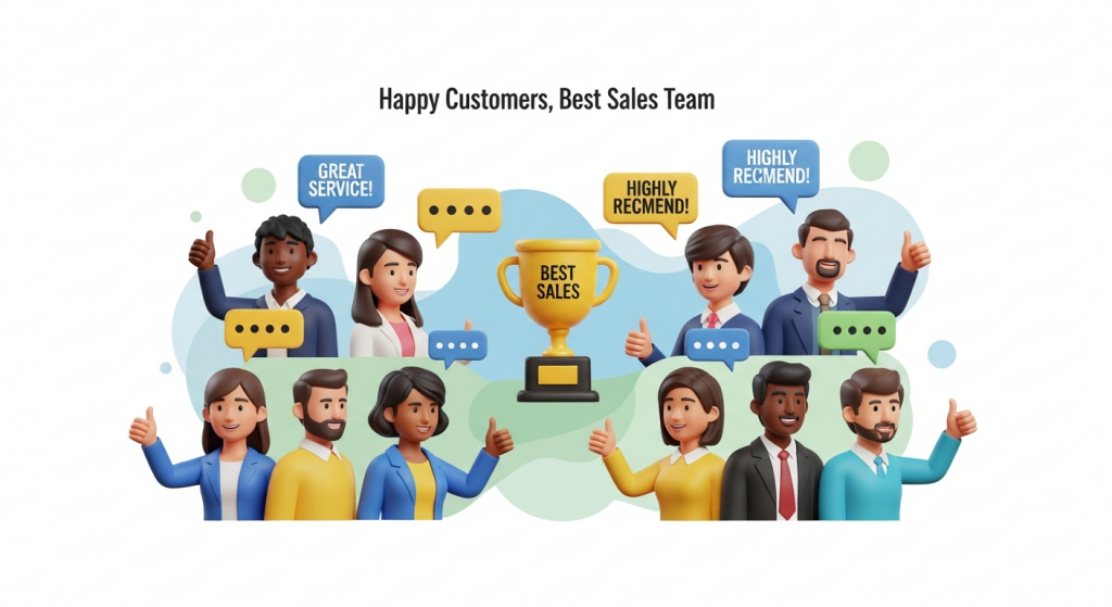 Turn Happy Customers into Your Best Sales Team: Using Testimonials and Case Studies to Build Trust In a crowded digital marketplace, trust is your most valuable currency. Potential customers are constantly bombarded with advertising claims and slick marketing messages. How do you cut through the noise and convince them that you are the right choice? The answer doesn’t lie in a bigger ad budget or a flashier slogan. It lies in the authentic voices of your satisfied customers. This is the power of social proof. Testimonials and case studies are more than just nice additions to your website; they are foundational assets for building credibility and driving growth. They provide tangible evidence that you can deliver on your promises, transforming skeptical prospects into confident buyers. This guide will walk you through exactly how to collect, craft, and display these powerful trust signals to grow your small business. Why Social Proof is Your Most Powerful Marketing Asset At its core, social proof is a psychological phenomenon where people assume the actions of others in an attempt to reflect correct behavior in a given situation. When we see that others trust a brand, we’re more inclined to trust it ourselves. It’s the digital equivalent of choosing a busy restaurant over an empty one. You assume the crowd knows something you don’t. The data backs this up. According to a recent survey by BrightLocal, 76% of consumers ‘always’ or ‘regularly’ read online reviews when browsing for local businesses. This behavior isn’t just for restaurants or retail; it applies to service providers, contractors, and B2B companies. Your potential clients are actively looking for proof that you’re as good as you say you are. Testimonials vs. Case Studies: What’s the Difference? While both build credibility, they serve slightly different purposes. Understanding the distinction is key to using them effectively. Testimonials are short, emotional endorsements. They are quotes or short video clips that highlight a customer’s positive experience. Think of them as a powerful stamp of approval. They are perfect for building quick, memorable trust on your homepage or service pages. Case Studies are in-depth success stories. They are detailed narratives that walk a reader from a problem to a solution, backed by data and specific results. They are analytical and persuasive, ideal for convincing prospects who are further along in their decision-making process. Using a combination of both allows you to appeal to different types of buyers—the one who makes a quick, gut-feeling decision and the one who needs to see the hard data. Mastering the Art of the Testimonial A great testimonial can do more heavy lifting than a paragraph of your own marketing copy. But not all testimonials are created equal. A vague “They did a great job!” lacks the punch needed to truly persuade. What Makes a Testimonial Effective? The most impactful testimonials share three key traits: Authenticity: Always use a real customer’s full name, title, and company (with their permission). Adding a professional headshot or a logo instantly boosts credibility. A testimonial from “John S.” is far less believable than one from “John Smith, CEO of Acme Innovations.” Specificity: The best testimonials focus on specific outcomes. Instead of “We loved their service,” aim for “Their new website design increased our online appointment bookings by 45% in just two months.” Quantifiable results are always more compelling. Relatability: Feature customers that your ideal clients can see themselves in. If you serve local plumbers, a testimonial from a well-known plumbing company in your area will resonate far more than one from a completely unrelated industry. How to Collect Powerful Testimonials Your happiest customers are often willing to share their experiences; you just need to make it easy for them. The key is to ask at the right time—typically right after a project is successfully completed or when they give you unsolicited positive feedback. Streamline the process by: Sending a simple email: After a project wraps up, send a thank-you note and ask if they’d be willing to share a few sentences about their experience. Using a guided form: Instead of asking an open-ended question, guide them with prompts like, “What was the biggest challenge you faced before working with us?” and “What specific result are you most happy with?” Automating the request: You can use simple tools to automatically send a feedback request a week or two after a service is completed. Leveraging modern AI automations for small business can make this process seamless and ensure you never miss an opportunity. Where to Display Testimonials for Maximum Impact Don’t hide your best testimonials on a single, buried page. Sprinkle them throughout your website where they can support your marketing claims. An effective website design strategically places these trust signals where they matter most. On your homepage: Place two or three of your strongest, most impactful testimonials front and center to make a powerful first impression. On service or product pages: Pair relevant testimonials with the specific services they endorse. Near calls to action: Placing a positive quote next to a “Contact Us” or “Buy Now” button can reduce friction and provide the final nudge a user needs to convert. Unlocking Growth with Compelling Case Studies While testimonials provide a quick dose of credibility, case studies offer the deep, detailed proof that can seal the deal for a major project or a high-value client. They are a story of transformation, with your business as the hero that guided the client to success. The Anatomy of a High-Converting Case Study A successful case study follows a simple and powerful narrative structure that anyone can follow. Think of it as telling a story in three parts. The Challenge: Start by introducing your client and clearly outlining the problem they were facing before they hired you. What were their pain points? What goals were they trying to achieve? This sets the stage and makes the story relatable. The Solution: Detail the specific strategies and services you implemented to address their challenges. Explain the “why” behind your approach.
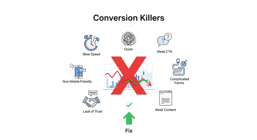 The 7 Website Conversion Killers Costing You Customers (And How to Fix Them) You’ve invested time, effort, and marketing dollars to drive traffic to your small business website. Visitors are arriving, analytics show the clicks, but there’s a problem: they aren’t taking action. They aren’t buying, signing up, or filling out your contact form. This gap between traffic and action is where conversions die, and it’s a frustration every business owner knows too well. A “conversion” is simply getting a visitor to complete a desired goal. It could be making a purchase, subscribing to a newsletter, or booking a consultation. Your conversion rate is the single most important metric for measuring your website’s success. If it’s low, it means your online storefront is leaking profits, no matter how much traffic you pour into it. The good news is that you can plug these leaks. Often, the culprits are common, easily identifiable issues that sabotage the user experience. By understanding these conversion killers and implementing targeted fixes, you can transform your website from a digital brochure into a powerful lead-generation and sales machine. Let’s dive into the seven most common offenders and how to stop them in their tracks. 1. Your Website is Painfully Slow In the digital age, patience is a scarce resource. If your website takes more than a few seconds to load, your potential customers are gone, likely heading straight to a competitor. According to research cited by Google, the probability of a visitor bouncing increases by 32% as page load time goes from 1 to 3 seconds. A slow website doesn’t just frustrate users; it tells them your business might be outdated or unprofessional. It’s also a critical ranking factor for search engines, meaning a slow site hurts your visibility and your sales. How to Fix It: Optimize Your Images: Large, uncompressed images are the number one cause of slow websites. Use tools like TinyPNG or ImageOptim to shrink file sizes without sacrificing quality. Also, ensure you’re using modern image formats like WebP. Invest in Quality Hosting: Cheap, shared hosting can be a bottleneck. Upgrading to a more robust hosting plan or a managed provider can dramatically improve your site speed and reliability. Leverage Browser Caching: Caching allows a visitor’s browser to store parts of your site, so it doesn’t have to reload everything on subsequent visits. Most modern platforms have plugins or settings to easily enable this. Minimize Code: Bloated themes, excessive plugins, and clunky code can weigh your site down. Regularly audit your tools and scripts, and work with a developer to ensure your code is clean and efficient. You can learn more about Google’s performance standards at their Core Web Vitals documentation. 2. The Design is Cluttered and Confusing Have you ever landed on a website and felt instantly overwhelmed? A chaotic layout, clashing colors, and too many things competing for your attention create cognitive overload. When a user has to work hard to figure out what to do or where to go, they will simply give up. A clean, intuitive design guides the user on a clear path toward conversion. It builds trust and makes the entire experience feel effortless. How to Fix It: Embrace Whitespace: Don’t be afraid of empty space. Whitespace (or negative space) helps reduce clutter, improves readability, and draws attention to the most important elements on the page, like your call to action. Establish a Clear Visual Hierarchy: Use size, color, and placement to guide the user’s eye. Your most important message (your value proposition) should be the most prominent, followed by supporting information and finally, your call to action. Stick to One Goal Per Page: Each page on your site should have a single, primary objective. For a product page, the goal is “Add to Cart.” For a landing page, it might be “Download the Ebook.” Focusing on one goal eliminates distraction and increases the likelihood of conversion. Our professional Website Design Services focus on creating clean, conversion-focused layouts that guide users to action. 3. Your Call to Action (CTA) is Weak or Missing You cannot expect users to read your mind. You have to tell them exactly what you want them to do next. A Call to Action (CTA) is the button or link that prompts this action, such as “Buy Now,” “Sign Up Free,” or “Request a Quote.” A website without clear, compelling CTAs is like a salesperson who never asks for the sale. It’s a dead end for the customer journey. How to Fix It: Use Action-Oriented Language: Start your CTA with a verb. Instead of “Submit” or “Learn More,” try more specific and benefit-driven phrases like “Get Your Free Guide” or “Start My 30-Day Trial.” Make It Stand Out: Your CTA button should be impossible to miss. Use a contrasting color that pops against the background, ensure it’s large enough to be easily clicked (especially on mobile), and surround it with a bit of whitespace. Strategic Placement: Place your primary CTA “above the fold” so users see it without scrolling. It’s also a best practice to repeat it at the bottom of the page for users who have read all your content and are now ready to act. 4. Your Site Isn’t Mobile-Friendly More than half of all web traffic now comes from mobile devices. If your website is difficult to navigate on a smartphone—requiring users to pinch, zoom, and scroll horizontally—you are alienating a massive portion of your audience. Google also prioritizes mobile-friendly sites in its search results (a practice called mobile-first indexing). In 2024, a non-responsive website is no longer an option; it’s a critical business liability. How to Fix It: Implement Responsive Design: A responsive website automatically adjusts its layout to fit any screen size, from a large desktop monitor to a small smartphone. This is the modern standard for web development and is essential for a good user experience. Test, Test, Test: Don’t just assume your site works on mobile. Use your own phone and ask others to test
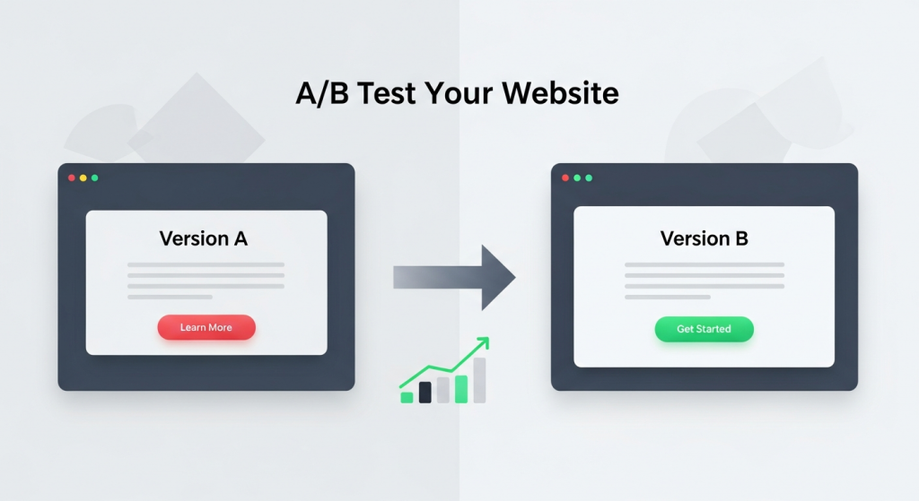 How to A/B Test Your Website for Better Results: A Small Business Guide As a small business owner, you invest significant time and resources into your website. But how do you know if it’s truly working for you? You might think your homepage headline is compelling or that your “Contact Us” button is in the perfect spot, but what if a small change could double your leads or sales? This is where the guesswork stops and data-driven strategy begins. Welcome to the world of A/B testing. It’s a powerful method for understanding customer behavior and systematically improving your website’s performance. And the best part? It’s not just for massive corporations with huge marketing departments. With the right approach and tools, any small business can leverage A/B testing to achieve meaningful growth. This guide will walk you through everything you need to know to get started. What Is A/B Testing and Why Does It Matter? Before diving into the “how,” it’s crucial to understand the “what” and “why.” A/B testing is one of the most effective ways to optimize your website for conversions, turning more visitors into loyal customers. A Simple Explanation of Split Testing A/B testing, also known as split testing, is a straightforward experiment. You create two different versions of a single webpage—Version A (the control) and Version B (the variation). The only difference between them is the one element you want to test, such as the headline, the color of a button, or a product image. You then show these two versions to a similar-sized audience simultaneously. Half of your visitors see Version A, and the other half sees Version B. By tracking how each group interacts with the page, you can collect data to determine which version more effectively achieves your goal. The version that performs better is your winner, which you can then implement permanently. The Business Impact of Data-Driven Decisions Why go to the trouble? Because A/B testing replaces assumptions with certainty. Instead of relying on gut feelings, you can make decisions based on how your actual customers behave. The benefits for your business are direct and measurable: Increased Conversion Rates: Whether your goal is selling a product, generating a lead, or getting a newsletter signup, testing helps you find the formula that encourages more visitors to take that desired action. Improved User Experience (UX): By testing elements like navigation, page layout, and form fields, you can remove friction points and make your site easier and more enjoyable for visitors to use. Reduced Bounce Rates: A well-optimized page that immediately communicates value and guides the user is more likely to keep them engaged, lowering the chance they’ll leave your site after viewing just one page. Higher Return on Investment (ROI): Optimizing your existing website traffic is one of the most cost-effective marketing strategies. Small improvements can lead to significant gains in revenue without needing to spend more on advertising. Getting Started: Your A/B Testing Toolkit You don’t need a massive budget or a team of data scientists to start A/B testing. Modern tools have made the process accessible for businesses of all sizes. Here’s what you need to begin. Essential Tools for Small Businesses The foundation of any good test is accurate data. To get started, you’ll need a way to measure traffic and a platform to run the tests. Web Analytics: Google Analytics 4 (GA4) is the industry standard and it’s free. It’s essential for understanding your website’s current performance, identifying pages with high traffic but low conversion rates (perfect candidates for testing), and measuring the impact of your changes. A/B Testing Platforms: While Google Optimize was a popular free tool, it has been sunsetted. However, many excellent alternatives exist. Platforms like VWO, Optimizely, and HubSpot’s Marketing Hub offer user-friendly visual editors that let you create variations without writing any code. Many website builders and e-commerce platforms also have built-in A/B testing features. Defining Your Goals and Hypotheses A successful test doesn’t start with a tool; it starts with a question. Before you change anything, you need to know what you’re trying to achieve. This begins with a clear goal and a solid hypothesis. Your goal should be specific and measurable. For example, “Increase contact form submissions on our services page by 15%.” Your hypothesis is an educated guess about how to achieve that goal. It follows a simple structure: “If I change [X], then [Y] will happen, because [Z].” For example: “If I change the ‘Submit’ button text to ‘Get Your Free Quote,’ then form submissions will increase, because the new text is more specific and highlights the value to the user.” What Should You Test on Your Website? The possibilities for A/B testing are nearly endless, but for a small business, it’s best to focus on high-impact areas first. Start with elements that have the most direct influence on your conversion goals. Here are some of the most effective things to test: Headlines and Subheadings: Your headline is the first thing most visitors read. Test different versions that emphasize a unique benefit, ask a question, or create a sense of urgency. Call-to-Action (CTA) Buttons: This is a classic A/B test. Experiment with the text (e.g., “Shop Now” vs. “Explore Our Collection”), color (e.g., a high-contrast color that stands out), size, and placement on the page. Images and Videos: The right visual can make a huge difference. Try testing a photo of your product versus a lifestyle image of it in use. You could also test having a short explainer video versus a static image banner. Page Layout and Navigation: How information is structured on your page can significantly impact user flow. Testing a single-column layout against a multi-column one or simplifying your navigation menu can lead to big wins. A clean and intuitive structure is a core component of our Website Design Services, as it directly influences user engagement. Forms: If your goal is lead generation, your forms are critical. Test the number of fields (fewer is often better), the wording
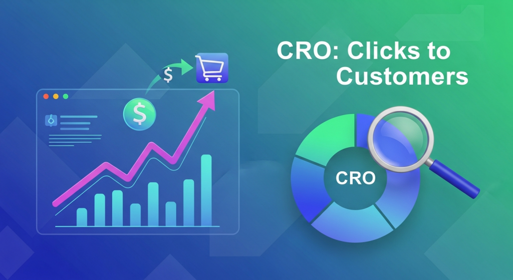 Conversion Rate Optimization: The Secret to Turning Clicks into Customers You’ve invested time, effort, and money into driving traffic to your website. Your social media is active, your ads are running, and people are showing up. But there’s a nagging question that keeps many business owners up at night: why aren’t more of these visitors turning into leads or sales? Getting clicks is only half the battle. The other, more crucial half is getting those clicks to convert. This is where Conversion Rate Optimization, or CRO, comes in. It’s not about finding more customers; it’s about getting more value from the ones you already have. For a small business, this isn’t just a marketing tactic—it’s a powerful strategy for sustainable growth. In this article, we’ll demystify CRO, explain why it’s a non-negotiable for your business, and provide a practical framework to get you started. What Exactly Is Conversion Rate Optimization (CRO)? Before we dive into the “how,” let’s clarify the “what.” At its core, CRO is the systematic process of increasing the percentage of website visitors who take a specific, desired action. This desired action is what we call a “conversion.” Understanding “Conversions” A conversion isn’t always a sale. It can be any valuable action a user takes on your website. Conversions can be large or small, but they all represent a step forward in the customer journey. Common examples include: Making a purchase (e-commerce) Filling out a contact or lead form Signing up for a newsletter Downloading a free guide or ebook Booking a demo or consultation Creating an account Your conversion rate is simply the percentage of visitors who complete one of these goals. The formula is straightforward: (Number of Conversions / Total Number of Visitors) x 100 = Conversion Rate. For example, if 1,000 people visit your landing page in a month and 20 of them fill out your contact form, your conversion rate for that page is 2%. CRO is the science and art of improving that percentage. It involves understanding how users navigate your site, what actions they take, and what’s stopping them from converting. It’s less about guesswork and more about data-driven decisions that enhance the user experience and guide visitors toward your goals. Why CRO is a Game-Changer for Small Businesses Many small businesses focus heavily on attracting new visitors through SEO and paid ads. While traffic is essential, CRO offers a more sustainable and cost-effective path to growth. Here’s why it’s so critical. Maximize Your Existing Traffic Acquiring new customers can be expensive. Constantly increasing your ad spend to get more traffic isn’t always a viable long-term strategy. CRO allows you to make the most of the audience you already have. By converting a higher percentage of your existing visitors, you increase revenue without necessarily increasing your marketing budget. A small 1% lift in your conversion rate can have a massive impact on your bottom line. Gain Deeper Customer Insights CRO forces you to step into your customers’ shoes. The process of optimizing your site involves analyzing user behavior, gathering feedback, and understanding their motivations and pain points. This isn’t just about changing a button color; it’s a form of market research. You learn what resonates with your audience, which helps you refine your messaging, products, and overall marketing strategy. These insights are invaluable for any business looking to build lasting customer relationships. Improve Your SEO Performance Search engines like Google want to provide users with the best possible results, and that means sending them to websites that offer a great experience. CRO and Search Engine Optimization (SEO) are closely linked. When you optimize your site for conversions, you are inherently improving the user experience (UX). Visitors stay longer, view more pages, and are less likely to “bounce” back to the search results. These positive engagement signals can lead to higher search rankings, creating a virtuous cycle of more traffic and more conversions. A solid SEO strategy is one that incorporates CRO principles from the start. Increase Profitability and ROI Ultimately, every business decision comes down to return on investment (ROI). Because CRO focuses on converting existing traffic, it’s one of the highest-leverage marketing activities you can undertake. Doubling your conversion rate effectively doubles the value of every visitor and halves your cost per acquisition. This efficiency allows you to grow faster, reinvest profits more confidently, and build a more resilient business. Getting Started with CRO: A Practical Framework CRO isn’t about making random changes and hoping for the best. It’s a structured process of continuous improvement. While complex, the fundamental framework is accessible to any business owner. Step 1: Identify Goals and Gather Data First, define what a “conversion” means for you. Use tools like Google Analytics to understand your current performance. Look for problem areas. Which pages have the highest exit rates? Where in the sales funnel are users dropping off? This quantitative data tells you *what* is happening. Then, use qualitative tools like heatmaps or user surveys to understand *why* it’s happening. Step 2: Formulate a Hypothesis Based on your data, form an educated guess about how you can improve performance. A good hypothesis follows a simple structure: “If I change [Independent Variable], then [Dependent Variable] will happen, because [Rationale].” For example: “If we change the contact form’s call-to-action from ‘Submit’ to ‘Get My Free Quote,’ then form submissions will increase, because the new text is more specific and value-oriented.” Step 3: Test Your Hypothesis with A/B Testing The most reliable way to test a hypothesis is through A/B testing (also called split testing). This involves creating a variation of your page (Version B) with the change you want to test and showing it to a portion of your visitors, while the rest see the original (Version A). You then measure which version results in a higher conversion rate. According to VWO, a leading A/B testing platform, this method eliminates guesswork and provides concrete data to guide your decisions. Step 4: Analyze Results and Implement the Winner Once
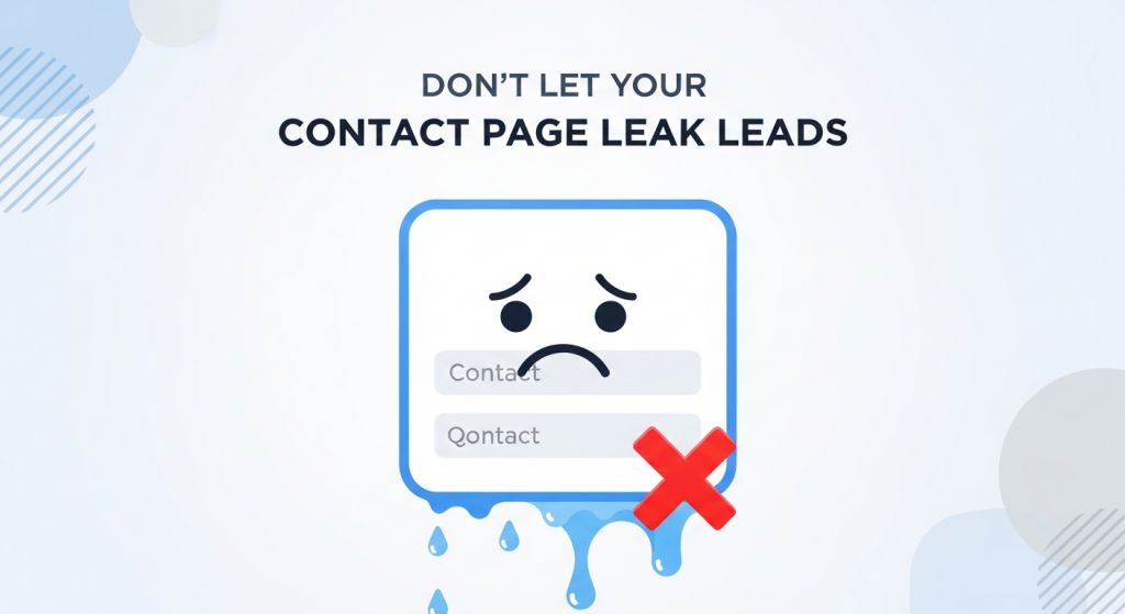 Why Your Contact Page Is Secretly Costing You Leads (And How to Fix It) You’ve done everything right. You invested in a great-looking website, spent money on digital marketing, and traffic is finally starting to flow. You see people clicking around, visiting your services pages, and spending time on your blog. But then… silence. The phone isn’t ringing, and your inbox is empty. It’s a frustratingly common scenario for small business owners, leaving them wondering where the disconnect is. The culprit is often hiding in plain sight: your contact page. Many businesses treat their contact page as a simple utility—a digital version of a business card tucked away at the back of their website. But this page isn’t just a placeholder; it’s one of the most critical conversion points on your entire site. It’s the final handshake, the moment a curious visitor decides to become a tangible lead. If that experience is confusing, frustrating, or untrustworthy, that potential customer is gone, likely for good. In this guide, we’ll uncover the common mistakes that turn your contact page into a dead end and provide actionable steps to transform it into a powerful lead generation machine. The Overlooked Powerhouse of Your Website Think about the typical customer journey. A potential client might find you through a Google search, read a blog post, and browse your services. By the time they navigate to your contact page, their intent is incredibly high. They are actively seeking a solution and are considering you as the provider. This isn’t a casual browser; this is someone on the verge of making a decision. Your contact page is the bridge between their problem and your solution. A poorly designed contact page creates friction at this crucial moment. It introduces doubt, annoyance, and second thoughts. A visitor might wonder if you’re a legitimate business, if you’ll ever respond, or if it’s even worth the effort to fill out your complicated form. According to user experience research, a user’s decision to trust a website is often made in seconds. A confusing or unprofessional contact page can shatter that trust instantly, wasting all the marketing effort and money that brought them there in the first place. 7 Common Contact Page Mistakes That Kill Conversions Optimizing your contact page doesn’t always require a complete overhaul. Often, small, strategic adjustments can make a world of difference. Let’s explore the seven most common pitfalls that might be costing you leads right now. 1. Your Contact Information is Hard to Find The most fundamental mistake is making it difficult for users to find the page itself. If a motivated prospect has to hunt for a way to get in touch, their motivation will quickly turn into frustration. People expect to find contact information in standard, predictable locations. The Fix: Ensure a clear link to your “Contact” or “Contact Us” page is prominently displayed in your website’s main navigation menu (the header) and in the footer of every page. This is a core principle of user-friendly navigation. As usability experts from the Nielsen Norman Group consistently point out, users rely on standard conventions to navigate websites efficiently. Don’t try to be clever with labels like “Get in Touch” or “Let’s Chat” in your main navigation; stick to the clear and universally understood “Contact.” 2. The Form is Too Long or Complicated Imagine you’re ready to ask for a quote, but you’re met with a form that feels like a tax return. It asks for your name, email, phone, company name, job title, company size, annual revenue, and a detailed project description. This is a major conversion killer. Every additional field you require is another reason for a user to abandon the process. The Fix: Keep your form as simple as possible. Ask only for the information you absolutely need to start a conversation. In most cases, this is: Name Email Address A message or comment box If you need more information, like a phone number, consider making it an optional field. If you must ask for more details, explain why. For example, next to a “Budget” field, you could add a small note: “(This helps us recommend the most suitable solutions for you).” Research from marketing platforms like HubSpot has repeatedly shown that reducing the number of form fields can significantly increase conversion rates. 3. A Glaring Lack of Trust Signals In an age of spam and data breaches, people are hesitant to share their personal information online. A generic contact page with nothing but a form can feel anonymous and untrustworthy. Visitors need reassurance that you are a real, credible business that will handle their inquiry professionally. The Fix: Build trust by humanizing your page. Include multiple trust signals, such as: A physical address: Even if you work remotely, a business address or P.O. box adds legitimacy. A business phone number: It shows you’re accessible. A professional email address: Use you@yourcompany.com, not a generic Gmail or Yahoo address. A link to your privacy policy: This assures users their data will be handled responsibly. Photos: A picture of your team or office can make your business feel more personal and real. 4. No Alternative Contact Methods Not everyone wants to fill out a form. Some people prefer the immediacy of a phone call, while others want to send a detailed email from their own client. Forcing every visitor down a single path can alienate a significant portion of your audience. The Fix: Offer multiple ways to connect. Cater to different preferences by providing a variety of options right on the page. Include a clickable phone number (so mobile users can tap to call), a linked email address that opens the user’s default mail client, and an embedded Google Map if you have a physical location they can visit. For businesses that rely on appointments, embedding a scheduling tool like Calendly can be a game-changer, allowing leads to book a meeting directly. 5. Vague or Missing Call to Action Your contact page needs to guide the
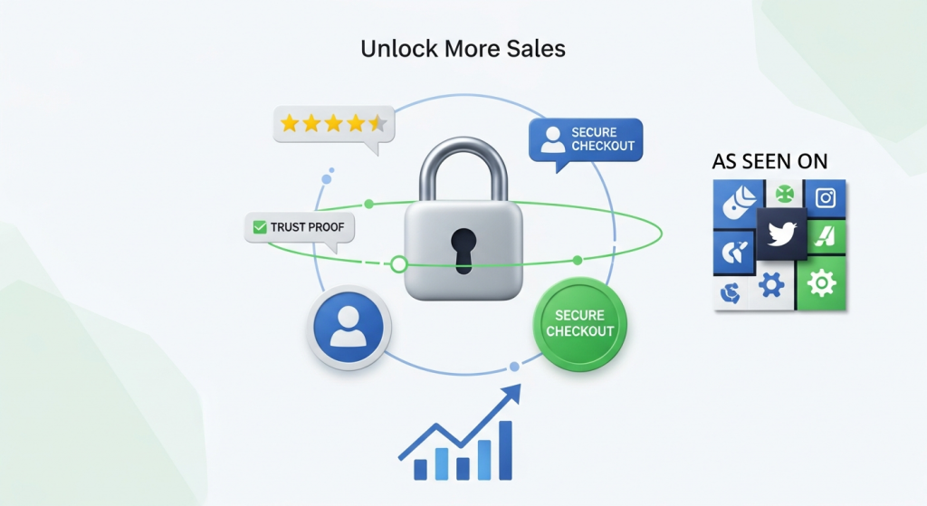 Unlock More Sales: The Proven Power of Trust Badges and Social Proof You’ve done the hard work. You’ve invested in a website, driven traffic to it, and showcased your products or services beautifully. Yet, you’re facing a frustratingly common problem: visitors browse, they click, but they don’t convert. Carts are abandoned, contact forms are left untouched, and potential sales vanish into the digital ether. What’s the invisible barrier holding them back? More often than not, it’s a simple lack of trust. In the anonymous world of the internet, trust isn’t given; it’s earned. Your website must work overtime to convince a skeptical visitor that you are credible, secure, and reliable. This is where two powerful psychological tools come into play: social proof and trust badges. These aren’t just decorative icons or a few nice quotes; they are fundamental signals that alleviate anxiety, build confidence, and guide users toward the “buy” button. This article will explore why these elements are crucial for conversions and how you can implement them effectively to turn hesitant visitors into loyal customers. Why Trust is Your Most Valuable Online Currency Think about your own online behavior. Would you enter your credit card details on a website that looks outdated or doesn’t have a secure connection? Probably not. Your customers are no different. Every online transaction, whether it’s a purchase or a simple email signup, involves an element of risk for the user. They are risking their money, their personal data, and their time. Your job is to minimize that perceived risk. A visitor needs to feel confident that your business is legitimate, that their payment information will be safe, and that you will deliver on your promises. When you successfully build that trust, the conversion process becomes nearly frictionless. According to a recent consumer survey, 87% of consumers read online reviews for local businesses, demonstrating just how much people rely on the experiences of others to make decisions. Without these trust signals, you are essentially asking customers to take a leap of faith, and most are unwilling to do so. Decoding Social Proof: Letting Your Customers Sell for You Social proof is a psychological phenomenon where people assume the actions of others reflect correct behavior for a given situation. In simpler terms, we see what others are doing and we follow suit. When you effectively leverage social proof on your website, you are showing visitors that many other people have already trusted you and had a positive experience. This validation from peers is often more persuasive than any marketing copy you could write yourself. Key Types of Social Proof to Implement Integrating social proof isn’t a one-size-fits-all approach. Different forms resonate with different audiences and work best in different contexts. Here are some of the most effective types to consider for your small business website: Customer Reviews and Testimonials: This is the cornerstone of social proof. Authentic reviews and detailed testimonials provide a direct look into the positive experiences of past customers. Go beyond just a name and a quote; include a photo, their company or city, and specifics about the results they achieved. Placing relevant testimonials on service pages or next to product descriptions can directly address a potential customer’s specific concerns. Star Ratings: For e-commerce stores or service-based businesses, star ratings offer a quick, visual summary of customer satisfaction. They are easily digestible and allow users to filter products or services based on collective opinion. Seeing a product with hundreds of 4.5-star ratings instantly builds more confidence than one with no ratings at all. Case Studies: While testimonials are short and powerful, case studies are in-depth success stories. They are particularly effective for B2B companies or high-value services. A great case study outlines a customer’s problem, your proposed solution, and the measurable, positive results you delivered. It’s a narrative that proves your expertise and value. “As Seen On” or Award Logos: If your business has been featured in the media, won an industry award, or is a member of a respected organization, showcase it! Displaying logos from well-known publications or institutions borrows their authority and transfers some of that credibility to your brand. User-Generated Content (UGC): Encourage your customers to share photos or videos of themselves using your product on social media. Featuring this content on your website provides authentic, real-world proof that people not only buy your product but also love it enough to share it publicly. It creates a sense of community and relatability. The Power of the Badge: Building Instant Credibility While social proof shows that others trust you, trust badges communicate that your site is technically secure and that your business operates with integrity. These are visual symbols and logos that instantly signal safety and reliability, especially at critical moments like the checkout process. Research from the Baymard Institute, a leader in e-commerce usability, consistently shows that the perception of security is a top concern for users during checkout. Their studies have revealed that a significant percentage of cart abandonments happen because users don’t trust the site with their credit card information. Trust badges directly combat this fear. Essential Trust Badges for Your Website Just like social proof, different badges serve different purposes. Here are the most important categories to include: Secure Checkout Badges (SSL): An SSL (Secure Sockets Layer) certificate is non-negotiable in today’s digital world. It encrypts data between your customer’s browser and your server, protecting their sensitive information. This is visually represented by the padlock icon and “https://” in the browser’s address bar. Explicitly displaying a “Secure Checkout” or “256-Bit SSL Encrypted” badge further reinforces this security. Accepted Payment Logos: Displaying the logos of major credit cards like Visa, Mastercard, and American Express, as well as digital wallets like PayPal or Apple Pay, does more than just show payment options. These are globally recognized brands that users already trust. Their presence on your site creates a halo effect, lending their credibility to your business. Third-Party Endorsement Badges: These are seals of approval from well-known third-party organizations.
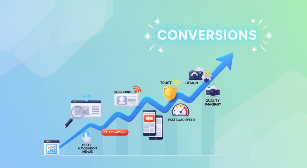 7 Web Design Elements That Boost Conversions Instantly Your website is your most powerful digital asset. It’s your 24/7 salesperson, your digital storefront, and often, the first impression a potential customer has of your brand. But is it doing its job? A beautiful website that doesn’t convert visitors into leads or customers is like a fancy sports car with no engine—it looks great, but it’s not going anywhere. Many small business owners fall into the trap of focusing solely on aesthetics, overlooking the strategic elements that actually drive action. The difference between a website that just exists and one that actively grows your business lies in conversion-focused design. This isn’t about secret formulas or magic tricks; it’s about understanding user psychology and intentionally guiding visitors toward a desired outcome. In this article, we’ll break down seven essential web design elements that can instantly improve your website’s performance. By implementing these proven strategies, you can transform your site from a passive online brochure into a powerful conversion machine. 1. A Crystal-Clear Value Proposition When a visitor lands on your homepage, you have about three seconds to answer their most pressing question: “What’s in it for me?” If they can’t figure out what you do and why they should care, they’ll hit the back button without a second thought. This is where your value proposition comes in. What is a Value Proposition? Your value proposition is a concise, compelling statement that clearly communicates the unique benefit you offer to your customers. It’s not just a slogan or a tagline. It should instantly tell visitors: Exactly what product or service you offer. Who your target customer is. The key problem you solve or the primary benefit you provide. Why you are the best choice over your competitors. How to Implement It Effectively Your value proposition should be the first thing people see, typically “above the fold” (the part of the page visible without scrolling). A classic, effective format includes a strong headline, a descriptive sub-headline, and a compelling hero image or video that visually reinforces your message. Focus on clarity over cleverness. Use simple language that anyone can understand and avoid industry jargon. 2. Intuitive and Simple Navigation Think of your website’s navigation as a roadmap. If the map is confusing, cluttered, or inaccurate, your visitors will get lost and frustrated. Great navigation, on the other hand, makes it effortless for users to find exactly what they’re looking for, guiding them smoothly through your site and toward your conversion goals. The “Don’t Make Me Think” Principle The golden rule of usability, as detailed in Steve Krug’s famous book, is to not make users think. Your menu labels should be predictable and conventional. While it might be tempting to use creative names like “Our Journey” or “Discover,” standard labels like “About Us” and “Services” are instantly recognizable and require zero mental effort from the user. According to usability research from the Nielsen Norman Group, users depend on clear navigation to understand your site’s structure and their place within it. Best Practices for Navigation Keep your main menu clean and concise, ideally with no more than seven items. Organize your pages in a logical hierarchy, and if you have many pages, use clear drop-down menus. A prominent search bar can also be a powerful tool, especially for sites with a lot of content. Clean navigation is not just good for users; it also helps search engines understand and index your site, which is a core component of a successful SEO strategy. 3. Strategic and High-Contrast Calls-to-Action (CTAs) You can’t expect visitors to take action if you don’t ask them to. A Call-to-Action (CTA) is exactly what it sounds like: a prompt, usually a button or a link, that encourages the user to take a specific next step. Effective CTAs are the critical link between a visitor browsing your site and becoming a lead or customer. What Makes a CTA Effective? The best CTAs use strong, action-oriented language. Instead of passive words like “Submit” or “Enter,” use benefit-focused phrases like “Get Your Free Quote,” “Download My Guide,” or “Start Your Free Trial.” The design is equally important. Your CTA buttons should use a color that contrasts sharply with the background and surrounding elements, making them impossible to miss. They should be large enough to click easily on both desktop and mobile devices. Placement is Everything Place CTAs strategically at points where the user is most likely to be ready to convert. This includes at the end of a blog post, below a list of services, or prominently in your website’s header. Don’t be afraid to repeat your primary CTA throughout a page to give users multiple opportunities to take the next step. 4. Mobile-First, Responsive Design In today’s digital landscape, designing for mobile is no longer an option—it’s a necessity. With over half of all global website traffic now coming from mobile devices, a poor mobile experience is a guaranteed way to lose customers. Google also uses mobile-first indexing, meaning it primarily uses the mobile version of your site for ranking and indexing. What “Mobile-First” Really Means A mobile-first approach means designing for the smallest screen first and then scaling up to larger devices. This forces you to prioritize the most essential content and features, resulting in a cleaner, more focused experience for all users. A responsive design ensures that your website automatically adjusts its layout, images, and text to fit any screen size, providing a seamless experience whether a visitor is on a smartphone, tablet, or desktop computer. A fully responsive website is a cornerstone of our Website Design Services because we know it’s fundamental to capturing leads from every possible source. Test your site on multiple devices to ensure buttons are easy to tap, forms are simple to fill out, and text is readable without pinching or zooming. 5. Trust Signals and Social Proof People do business with companies they know, like, and trust. For a new visitor who has never heard of
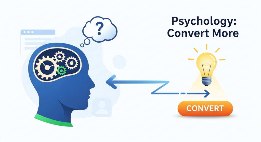 The Psychology Behind High-Converting Landing Pages: A Guide for Small Businesses What if your website could do more than just exist online? What if every click had a purpose, guiding visitors on a seamless journey from casual browser to loyal customer? This isn’t a matter of luck or magic; it’s a science. Specifically, it’s the science of high-converting landing pages, and its foundation is built on understanding human psychology. A landing page is your digital sales pitch. It’s a focused, standalone page designed with a single objective in mind, whether that’s capturing an email, scheduling a demo, or making a sale. Its success hinges not just on what you say, but on how you say it and the environment you create. By understanding the fundamental psychological triggers that influence decision-making, you can transform your landing pages from simple information portals into powerful conversion machines. For a small business, mastering this is a game-changer. You don’t need a massive budget to compete; you need a smarter approach. This guide will demystify the core psychological principles that turn clicks into customers, giving you actionable strategies to improve your online results. Why Psychology is Your Most Powerful Marketing Tool At its heart, marketing is about connection. It’s about understanding a customer’s problems, needs, and desires, and presenting your solution in a way that resonates deeply. A landing page is a controlled environment where you can apply these principles with precision. Every element, from the headline to the color of a button, can be optimized to tap into subconscious motivators and reduce friction in the user’s journey. Think of your visitor’s mindset. They arrive on your page with a question or a problem. They are looking for a clear, trustworthy, and compelling answer. Your job is to anticipate their thought process, address their objections before they even form, and build enough confidence to inspire action. By leveraging proven psychological frameworks, you can guide this process ethically and effectively, creating a better experience for the user and driving better results for your business. Key Psychological Principles for Landing Page Success Let’s break down the core principles that separate a mediocre landing page from a high-converting one. These concepts are universal because they are based on how the human brain is wired to process information and make decisions. 1. The Principle of Clarity: Less is More Our brains are wired for efficiency. We instinctively prefer things that are easy to understand and process, a concept known as cognitive fluency. A confusing or cluttered landing page creates “cognitive strain,” causing visitors to feel frustrated and abandon the page. The goal is to make your message so clear and simple that it requires virtually no mental effort to comprehend. One Goal, One Page: Every landing page should have a single, clearly defined goal. If you want them to download an ebook, every element should support that action. Don’t distract them with links to your blog, social media, or other services. A Compelling Headline: Your headline is the first—and sometimes only—thing people read. It must immediately answer the visitor’s question: “What’s in it for me?” Use it to state your unique value proposition clearly and concisely. Embrace White Space: White space (the empty area around text and images) isn’t wasted space; it’s a powerful design tool. It helps focus attention on key elements, improves readability, and gives your page a clean, professional feel. Simple Language: Avoid industry jargon and complex vocabulary. Write as you would speak to a customer. This clarity is a fundamental part of our professional Website Design Services, ensuring your message always connects. 2. Social Proof: The Power of the Crowd When we’re uncertain about a decision, we often look to others for guidance. This is social proof. Seeing that other people have used and trusted a product or service reduces our perceived risk and builds confidence. As a business, showcasing your existing customers’ satisfaction is one of the most persuasive things you can do. According to research and analysis by CXL, social proof is a powerful tool for optimizing conversions because it leverages our natural tendency to conform. Testimonials and Reviews: Use quotes from real, happy customers. Including their full name, company, and a photo adds a significant layer of authenticity. Case Studies: Go beyond a simple quote by detailing the problem a client faced, how your solution helped, and the measurable results they achieved. Trust Logos: Display logos of well-known clients you’ve worked with, awards you’ve won, or publications you’ve been featured in. Data and Numbers: Use specific numbers like “Trusted by 10,000+ small businesses” or “98% customer satisfaction rate” to provide concrete evidence of your value. 3. Scarcity and Urgency: The Fear of Missing Out (FOMO) The fear of missing out, or FOMO, is a powerful motivator. We tend to place a higher value on things we believe are in short supply or available for a limited time. This principle encourages visitors to act now rather than later, combating the natural human tendency to procrastinate. When used ethically, scarcity and urgency can significantly boost conversion rates. Limited-Time Offers: Use a countdown timer to show a deal expiring. This creates a clear and visual sense of urgency. Limited Quantities: Phrases like “Only 3 spots left” or “While supplies last” suggest scarcity and can prompt immediate action. Exclusive Access: Offer a special bonus or discount for the “first 100 sign-ups,” making the offer feel more exclusive and valuable. You can even leverage modern tools to deliver these messages effectively. For example, some of our clients use AI Automations for Small Business to personalize urgent offers based on user behavior, making them even more compelling. 4. Authority and Trust: Why Credibility Sells Before a customer will give you their money or personal information, they need to trust you. Building credibility is non-negotiable. Authority is the perception that you are an expert in your field. A professionally designed, secure, and transparent website is the foundation of this trust. The Nielsen Norman Group emphasizes that a site’s
 The 5 Best WordPress SEO Plugins to Dominate Search in 2025 For any small business, showing up on the first page of Google isn’t just a goal; it’s a necessity. Your website is your digital storefront, and search engine optimization (SEO) is the map that guides customers to your door. If you’re using WordPress, you’re already on the right track. It’s a powerful platform, but to truly unlock its potential, you need the right tools. That’s where SEO plugins come in. These powerful add-ons transform your WordPress dashboard into an SEO command center, simplifying complex tasks and providing clear guidance to help you climb the search rankings. But with so many options available, which one is right for your business in 2025? We’ve analyzed the top contenders to help you make an informed decision that drives real results. Why Your WordPress Website Needs an SEO Plugin At its core, SEO involves telling search engines like Google what your pages are about and why they are valuable. While WordPress has some basic SEO features built-in, a dedicated plugin gives you granular control over the critical elements that search engines scrutinize. Without one, you’re essentially flying blind. A good SEO plugin helps you: Optimize Content: Get real-time feedback on your posts and pages to ensure you’re effectively using target keywords, writing compelling meta descriptions, and structuring content for both users and search engine crawlers. Manage Technical SEO: Easily create and submit XML sitemaps to help Google index your site, control how your content appears in search results, and manage redirects to avoid broken links. Implement Schema Markup: This is a type of code that helps search engines understand the context of your content, leading to “rich snippets” in search results—like star ratings, event details, or prices. A plugin automates this complex process. Improve Site Structure: Use features like breadcrumbs and internal linking suggestions to create a better user experience and distribute “link equity” throughout your site, which can significantly boost your rankings. Think of an SEO plugin as your co-pilot. It handles the technical details so you can focus on what you do best: running your business and creating great content for your customers. Our Top Picks: The Best WordPress SEO Plugins for 2025 We’ve reviewed the leading plugins based on their features, ease of use, and overall value for small businesses. Here are the top five you should consider for the coming year. 1. Rank Math: The Feature-Packed Powerhouse Rank Math has rapidly become a favorite in the WordPress community, and for good reason. It bills itself as the “Swiss Army Knife of WordPress SEO,” and it lives up to the name by packing an incredible number of features into a sleek, intuitive interface—many of which are only available in the premium versions of its competitors. Its standout feature is the built-in Content AI, which provides sophisticated suggestions for keywords, questions, and links as you write. The setup wizard is fantastic for beginners, guiding you through the optimal settings for your specific type of business. Rank Math also offers advanced schema markup options, 404 error monitoring, and seamless integration with Google Analytics and Google Search Console right within your WordPress dashboard. Best for: Business owners who want a comprehensive, all-in-one solution without paying for multiple premium tools. It’s powerful enough for experts but user-friendly enough for those just starting their SEO journey. 2. Yoast SEO: The Trusted Industry Standard Yoast SEO is arguably the most well-known WordPress plugin on the planet. For years, it has been the go-to choice for millions of websites, from personal blogs to major corporations. Its strength lies in its simplicity and focus on on-page SEO fundamentals. The famous green, orange, and red traffic light system provides instant, actionable feedback on both SEO and readability. This makes it incredibly easy for non-technical users to understand what they need to do to improve a page. Yoast excels at creating XML sitemaps, managing title and meta descriptions, and ensuring your content is easy for both humans and search engines to read. While its free version is robust, the premium version unlocks powerful features like internal linking suggestions, redirect management, and 24/7 support. Best for: Beginners and business owners who want a reliable, straightforward tool that excels at the core principles of on-page SEO. If you value ease of use and clear guidance above all else, Yoast is an excellent choice. 3. All in One SEO (AIOSEO): The Complete Toolkit As one of the original WordPress SEO plugins, All in One SEO has continuously evolved to remain a top competitor. AIOSEO offers a comprehensive suite of tools designed to cover every aspect of your site’s optimization. Its setup wizard is one of the best, ensuring you configure everything correctly from the start. One of its strongest features is the TruSEO on-page analysis, which provides a detailed checklist to help you optimize every post and page. AIOSEO also has powerful modules for local SEO, making it a fantastic option for brick-and-mortar businesses that need to rank in local map packs. It integrates beautifully with WooCommerce for e-commerce SEO and offers advanced schema generation to help your products stand out. For a deep dive into how structured data impacts search, Moz offers an excellent guide on Schema. Best for: Small businesses, especially those with a local focus or an e-commerce store, who need a complete and user-friendly SEO toolkit. 4. SEOPress: The White-Label-Ready Performer SEOPress is a powerful and surprisingly affordable alternative to the bigger names. It offers a clean, ad-free interface and a feature set that rivals the premium versions of other plugins, even in its free version. You can manage titles and metas, create XML and HTML sitemaps, and integrate Google Analytics with ease. Where SEOPress truly shines is its Pro version. For a single low price, you get access to an incredible array of tools, including advanced schema markup, local SEO, broken link checking, and full WooCommerce integration. It’s also “white-label” ready, meaning agencies and developers can remove